Contributors:
Mennatallah El-Assady, Rita Sevastjanova, Daniel Keim, and Christopher Collins
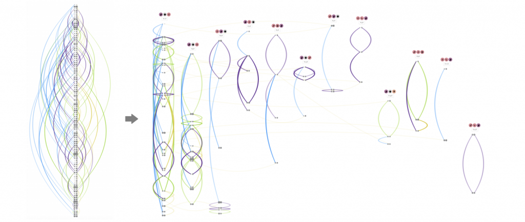
We present ThreadReconstructor, a visual analytics approach for detecting and analyzing the implicit conversational structure of discussions, e.g., in political debates and forums. Our work is motivated by the need to reveal and understand single threads in massive online conversations and verbatim text transcripts. We combine supervised and unsupervised machine learning models to generate a basic structure that is enriched by user-defined queries and rule-based heuristics. Depending on the data and tasks, users can modify and create various reconstruction models that are presented and compared in the visualization interface. Our tool enables the exploration of the generated threaded structures and the analysis of the untangled reply-chains, comparing different models and their agreement. To understand the inner workings of the models, we visualize their decision spaces, including all considered candidate relations. In addition to a quantitative evaluation, we report qualitative feedback from an expert user study with four forum moderators and one machine learning expert, showing the effectiveness of our approach.
Publications
-
[pods name="publication" id="4233" template="Publication Template (list item)" shortcodes=1]