-
AnchoR: Toward Asynchronous Collaboration and Guided Exploration for Mobile AR Visualizations
-
GazeQ-GPT: Gaze-Driven Question Generation for Personalized Learning from Short Educational Videos
-
LangEye: Vocabulary Learning From the World Around You
-
Card-IT Language Learning
A novel approach to training and testing Italian verb morphology by developing a flashcard application with a finite-state morphological (FSM) analyzer which both analyzes a user’s input and dynamically generates specific verb forms (flashcards).
-
Academia is Tied in Knots
A data visualization project aimed at giving visibility to the issue of sexual harassment in the academic community.
-
Tilt-Responsive Techniques for Digital Drawing Boards
An investigation into a range of app-specific transitions on tilt-adjustable drawing boards in response to changes in display angle such as reading vs. writing (annotation), public vs. personal, and shared person-space vs. task-space, among others.
Vialab is led by Dr. Christopher Collins at Ontario Tech University.
In addition to this site, visit our Github for software and our Blog for approachable reports of our innovations.
Research Blog
-
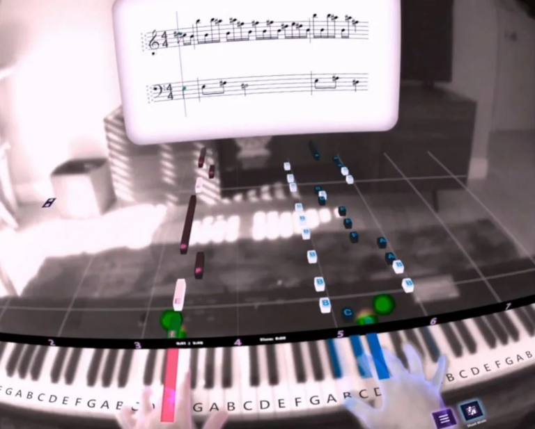
AI Meets the Piano: How LLMs Are Transforming Sight-Reading Practice
Learning to play the piano is a deeply rewarding journey, but it comes with a notoriously steep hurdle: sight-reading. Sight-reading is the ability to read and play a piece of sheet music fluently on the first look, much like reading a book out loud in your native language. While essential ...Read More
More from our blog
-
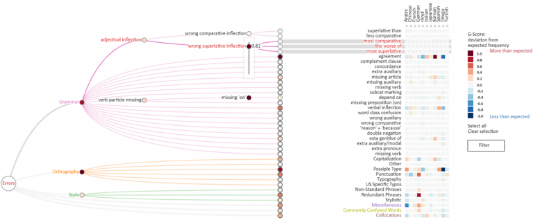
Visualizing Language Transfer Effects in Large Learner Corpora
Second Language Acquisition (SLA) is a research field that studies the process of learning another language. Language transfer effects occur when the learner applies structural, grammatical, or semantic rules from their native language to the language they are trying to learn. For example, a native ...Read More
-
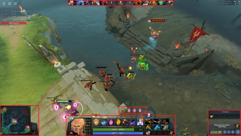
Can Eye Tracking Predict How Good You Are at Video Games?
When you jump into a competitive online game, finding balanced matches is everything. Competitive games need ways to distinguish different levels of player proficiency. But what if a computer could estimate your skill level simply by observing where your eyes move across the screen? In his honours ...Read More
-
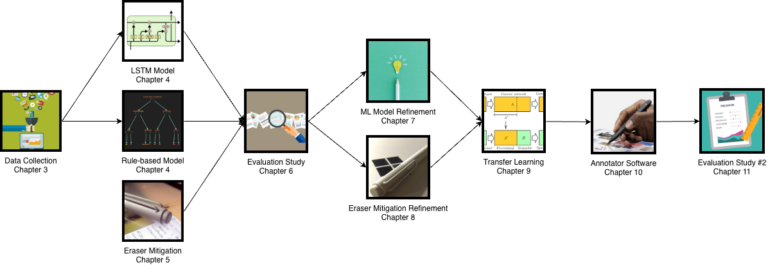
Beyond Menu Hopping: How “Magic Pen” Automatically Detects Your Pen Mode
When reading, grading, or editing a document with a digital stylus, your workflow can be interrupted by a frustrating problem: having to stop, move your hand across the screen, and select a toolbar option just to switch between writing notes, highlighting keywords, or underlining text. In ...Read More
-
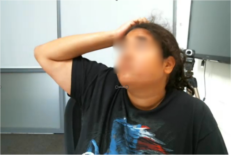
Making Data Less Stressful: A Smart System That Knows When You’re Frustrated
We’ve all been there: you’re trying to use a new piece of software, but the buttons don’t make sense, the data looks like a confusing mess, and you’re starting to feel your blood boil. Usually, computers are oblivious to our “human” moments. They sit there silently while we get more and more ...Read More
-

Digital Time Capsules: Exploring Geolocated Media Sharing
We rarely think about past experiences until we actively scroll back through our phone galleries or physical photo albums. But what if your surroundings could remind you of those moments automatically? Inspired by real-world treasure hunting in Geocaching and the historical photo overlays of Replay ...Read More
-
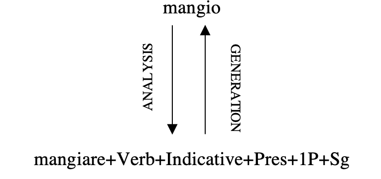
Mastering Italian Verb Conjugation: How NLP Powers the “Card-it” Digital Flashcard App
Learning a morphologically rich language like Italian is an exciting journey, but mastering its intricate system of verb conjugations and inflections can be a daunting challenge for many learners. Traditional tools often fall into two camps: rigid apps with pre-set decks that cannot be customized ...Read More
For more posts from our research blog, check out our Medium Page.
Gallery

News & Updates
- Technology for AI-Supported Learning: Ontario Tech Student Showcases Research at Prestigious GI ’25 Conference in Kelowna
- Ontario Tech students propose generative AI platform to preserve Indigenous languages
- Vialab members to have largest ever presence at the IEEE VIS Conference
- Vialab members presenting award-winning work at the ACM CHI Conference on Human Factors in Computing Systems
- Vialab member Menna El-Assady to present ‘ThreadReconstructor: Modeling Reply-Chains to Untangle Conversational Text through Visual Analytics’ at EuroVis 2018 in Brno.
- 2016 Course Materials