Menu Close

Balancing Clutter and Information in Large Hierarchical Visualizations

Contributors:

Rafael Veras and Christopher Collins

In this paper, we propose a new approach for adjusting the level of abstraction of hierarchical visualizations as a function of display size and dataset. Using the Minimum Description Length (MDL) principle, we efficiently select tree cuts that feature a good balance between clutter and information. We present MDL formulae for selecting tree cuts tailored to treemap and sunburst diagrams and discuss how the approach can be extended to other types of multilevel visualizations. In addition, we demonstrate how such tree cuts can be used to enhance drill-down interaction in hierarchical visualizations by enabling quick exposure of important outliers. The paper features applications of the proposed technique on treemaps of the Directory Mozilla (DMOZ) dataset (over 500,000 nodes), and on the Docuburst text visualization tool (over 100,000 nodes).

Validation is done with the feature congestion measure of clutter in views of a subset of the current DMOZ web directory. The results show that MDL views achieve near-constant clutter levels across display resolutions. We also present the results of a crowdsourced user study where participants were asked to find targets in views of DMOZ generated by our approach and a set of baseline aggregation methods. The results suggest that, in some conditions, participants are able to locate targets (in particular, outliers) faster using the proposed approach.

Check out our GitHub Repository for source code related to this project.

The slides from our VIS 16 presentation are available here.

Publications

    [pods name="publication" id="4278" template="Publication Template (list item)" shortcodes=1] [pods name="publication" id="4350" template="Publication Template (list item)" shortcodes=1]

Acknowledgements

Glidgets

Dynamic graphs, actively used domains such as social, biological, or computer network analysis, are challenging to visualize and explore due to simultaneous topological changes occurring over time. Glidgets presents a new combined direct manipulation and visualization technique for exploring and querying dynamic graphs. Traditional approaches provide an indirect time slider and employ visual cues such as global change highlighting. This work merges temporal navigation and the visual representation of graph dynamics into new interactive visual glyphs on nodes and edges. Interactive timeline glyphs reveal the presence and absence of nodes and edges, and node degree. Using sketch-based interaction, the glyphs are used to create queries and navigate time directly on graph nodes and edges. This enables one-stroke gestures to create queries such as “Are these nodes ever connected?” or “When is this node present in the network?” Analysts can directly query changing graph elements and investigate those changes by navigating time while remaining focused on the element of interest.

Try our demo!

Publications

    [pods name="publication" id="4335" template="Publication Template (list item)" shortcodes=1]

Acknowledgements

DimpVis Direct Manipulation for Visualization

In time-varying information visualizations, changes in data values over time are most often shown through animation, or through interaction with a time slider widget. We introduce a new direct manipulation technique for interacting with visual items in information visualizations to enable exploration of the time dimension. This interaction is guided by visual hint paths which indicate how a selected data item changes through the time dimension of a visualization. Using DimpVis, navigation through time is controlled by manipulating any data item along its hint path. All other items are updated to reflect the new time. We illustrate how DimpVis can be applied to time-varying scatter plots, bar charts, pie charts and heatmaps. Results from a comparative, task-oriented evaluation of DimpVis, the slider and static multiple images show that DimpVis for the scatterplot significantly outperformed multiple images, was quantitatively competitive with the slider and was subjectively preferred by participants.

Publications

    [pods name="publication" id="4362" template="Publication Template (list item)" shortcodes=1] [pods name="publication" id="4344" template="Publication Template (list item)" shortcodes=1]

Acknowledgements

Lexichrome: Lexical Discovery with Word-Color Associations

Contributors:

Chris K. Kim, Christopher Collins, Uta Hinrichs, Saif M. Mohammad

Based on word-colour associations from a comprehensive, crowdsourced lexicon, we present Lexichrome: a web application that explores the popular perception of relationships between English words and eleven basic colour terms using interactive visualization. Lexichrome provides three complementary visualizations: “Palette” presents the diversity of word-colour associations across the colour palette; “Words” reveals the colour associations of individual words using a dictionary-like interface; “Roget’s Thesaurus” uncovers colour association patterns in different semantic categories found in the thesaurus. Finally, our text editor allows users to compose their own texts and examine the resultant chromatic fingerprints throughout the process. We studied the utility of Lexichrome in a two-part qualitative user study with nine participants from various writing-intensive professions. We find that the presence of word-colour associations promotes awareness surrounding word choice, editorial decision, and audience reception, and introduces a variety of use cases, features, and future opportunities applicable to creative writing, corporate communication, and journalism.

Lexichrome is available for public access at http://lexichrome.com.


Publications

    [pods name="publication" id="4179" template="Publication Template (list item)" shortcodes=1] [pods name="publication" id="4341" template="Publication Template (list item)" shortcodes=1]

Acknowledgements

Thanks to Jason Boyd and Laurie Petrou. This research was funded by the Natural Sciences and Engineering Research Council of Canada (NSERC).

Investigating the Semantic Patterns of Passwords

Summary

What is the meaning within a password?  And, how does the meaning in your password relate to security risks?  In our research into the ‘secret language of passwords,’ we have investigated the numerical and textual patterns from a semantic (meaning) point of view.  Where prior research investigated letter and number sequences to expose vulnerable passwords, such as “password123,” our research has delved into the composition of seemingly complex passwords such as “ilovedan1201” or “may101982” and revealed common patterns.  In these cases, the patterns of <I><love><male-name><number> and <month in letters><day in numbers><year after 1980 in numbers> are common patterns which, once learned, can be used to generate password guesses, such as “IloveMike203” and “July022001”.

Using linguistic analysis and interactive visualization techniques, we have investigated the patterns of date-like numbers in passwords, and the meaning and relationships between types of words in passwords.  The resulting analysis guided our creation of a password guessing system (not available to the public!) which on several measures is better than any prior published result.  The exposed vulnerabilities are motivating our ongoing work into new ways to help people create semantically secure passwords. This research contributed to a major story in the New York Times Magazine on the Secret Life of Passwords.

Our research started with the many large password leaks that were made publicly available on the Internet.  In particular, the 32 million passwords from the RockYou website, exposed in 2009.

Our published research was conducted in two phases:

Date and Numbers

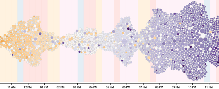
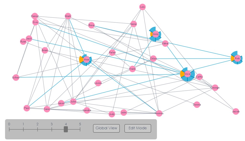
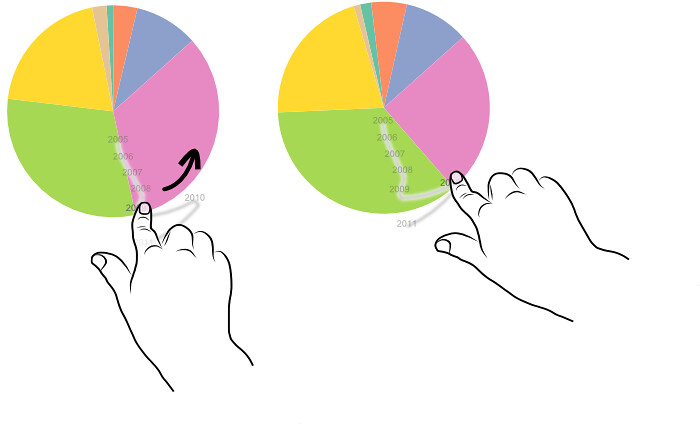
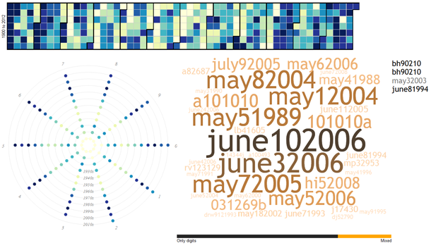
We started exploring date patterns, as 24% of the RockYou passwords contain a numeric sequence of at least 4 digits. So we wondered whether or not these sequences are dates, and if so, are there any temporal patterns? Our analyses found that 6% of these passwords (almost 2 million accounts!) contain numbers that match a date. To facilitate exploration of the patterns in the choice of dates, we created an interface that allows one to find the frequency that each day, month, year or decade (back to the year 1900) is referred to, as well as the corresponding passwords. We did not count passwords with numbers that are more likely to be keyboard patterns than dates, such as “111111”. Exploring the data through this interface, we confirmed some predictable patterns, such as the preference for dates that have repeated days and months (e.g., 08/08/1989), but also uncovered hidden ones, such as a consistent preference for the first two days of months, holidays, and a few notorious dates (e.g., Titanic accident) . For a detailed report on this work please read our paper or try our exploratory interface.

Words and Building a Password Grammar

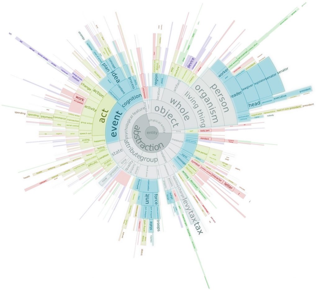
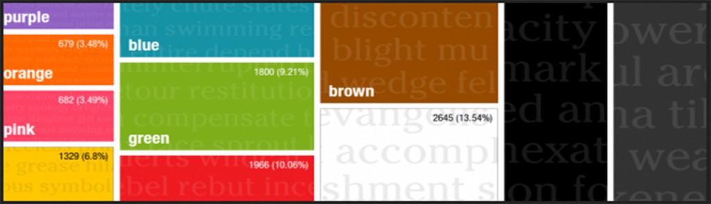
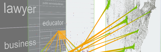
In the second part of this research, we turned our attention to semantic patterns in the choice of words. Employing natural language processing techniques, we broke each password into words and classified the words according to their syntactic (grammar) function and semantic (meaning) content. The result is a rich model representing the syntactic and semantic patterns of a collection of passwords. With this model, we can rank the semantic categories to find that “love” is the most prevalent verb in passwords, “honey” is the most used food-related word, and “monkey” is the most popular animal, for example. Contrary to reported psychology research, we found that many categories related to sexuality and profanity are among the top 100. Our work also brought insight into the relations between concepts; for example, our model shows that a male name is four times more likely to follow the string “ilove” than a female name. Our paper, published in the NDSS Symposium 2014, discusses the security implications of our work. In summary, we show that the security provided by passwords is overestimated by methods that do not account for semantic patterns.

Online Demos

Try the dates visualization yourself!

Try the words visualization yourself! 

Software

Semantic-Guesser

Media Coverage

Our research has also been featured in additional media, including:

We have also been featured on UOIT Homepage, including an article entitled “Heartbleed update: UOIT researchers analyze why consumers use weak passwords“.

Publications

    [pods name="publication" id="4365" template="Publication Template (list item)" shortcodes=1] [pods name="publication" id="4398" template="Publication Template (list item)" shortcodes=1] [pods name="publication" id="4347" template="Publication Template (list item)" shortcodes=1]

Acknowledgements

Thanks to undergraduate alumni Jeffrey Hickson and Swapan Lobana who worked as research assistants on this project, and to the funding agencies who supported this work.

Exploring Text Entities with Descriptive Non-photorealistic Rendering

Contributors:

Daniel Chang and Christopher Collins

We present a novel approach to text visualization called descriptive non-photorealistic rendering which exploits the inherent spatial and abstract dimensions in text documents to integrate 3D non-photorealistic rendering with information visualization.  The visualization encodes text data onto 3D models, emphasizing the relative significance of words in the text and the physical, real-world relationships between those words. Analytic exploration is supported through a collection of interactive widgets and direct multitouch interaction with the 3D models.  We applied our method to analyze a collection of vehicle complaint reports from the National Highway Traffic Safety Administration (NHTSA), and through a qualitative evaluation study, we demonstrate how our system can support tasks such as comparing the reliability of different makes and models, finding interesting facts, and revealing possible causal relations between car parts.

Publications

    [pods name="publication" id="4374" template="Publication Template (list item)" shortcodes=1] [pods name="publication" id="4386" template="Publication Template (list item)" shortcodes=1]

Acknowledgements

Bubble Sets

Bubble Sets

Contributors:

Christopher Collins, Gerald Penn, and Sheelagh Carpendale

While many data sets contain multiple relationships, depicting more than one data relationship within a single visualization is challenging. We introduce Bubble Sets as a visualization technique for data that has both a primary data relation with a semantically significant spatial organization and a significant set membership relation in which members of the same set are not necessarily adjacent in the primary layout. In order to maintain the spatial rights of the primary data relation, we avoid layout adjustment techniques that improve set cluster continuity and density. Instead, we use a continuous, possibly concave, isocontour to delineate set membership, without disrupting the primary layout. Optimizations minimize cluster overlap and provide for the calculation of the isocontours at interactive speeds. Case studies show how this technique can be used to indicate multiple sets on a variety of common visualizations.

Software

Using prefuse

Source code as an Eclipse project (requires prefuse; I recommend the latest prefuse from the CVS repository, but the beta release will also work.) [v.3 updated 24 November 2010]

Also, you can now download the code for the papers timeline explorer. It is somewhat messy and depends on the BubbleSets code (above) as well as prefuse and the two jar libraries included in the archive.

As a stand-alone Java library

Bubble Sets library on GitHub (thanks Josua Krause for creating a testing application)!

Javascript version of the library

Publications

    [pods name="publication" id="4440" template="Publication Template (list item)" shortcodes=1]

Acknowledgements

Parallel Tag Clouds

Contributors:

Christopher Collins, Fernanda B. Viégas, and Martin Wattenberg

Do court cases differ from place to place? What kind of picture do we get by looking at a country’s collection of law cases? We introduce Parallel Tag Clouds: a new way to visualize differences amongst facets of very large metadata-rich text corpora. We have pointed Parallel Tag Clouds at a collection of over 600,000 US Circuit Court decisions spanning a period of 50 years and have discovered regional as well as linguistic differences between courts. The visualization technique combines graphical elements from parallel coordinates and traditional tag clouds to provide rich overviews of a document collection while acting as an entry point for the exploration of individual texts. We augment basic parallel tag clouds with a details-in-context display and an option to visualize changes over a second facet of the data, such as time. We also address text mining challenges such as selecting the best words to visualize, and how to do so in reasonable time periods to maintain interactivity.

This research was given the VAST Test of Time Award at the IEEE Conference in 2019.

Publications

    [pods name="publication" id="4449" template="Publication Template (list item)" shortcodes=1]

VisLink: Revealing Relationships Amongst Visualizations

VisLinks

Contributors:

Christopher Collins, Gerald Penn, and Sheelagh Carpendale

We have developed VisLink, a method by which visualizations and the relationships between them can be interactively explored. Our approach uses multiple 2D layouts, drawing each one in its own plane. These planes can then be placed and re-positioned in 3D space: side by side, in parallel, or in chosen placements that provide favoured views. Relationships, connections, and patterns between visualizations can be revealed and explored using a variety of interaction techniques including spreading activation and search filters.

We have also devised a formalism for understanding and comparing methods of multi-relationship visualization, and analyze how the most popular methods (compound graphs, coordinated multiple views, Semantic Substrates) compare to VisLink. VisLink readily generalizes to support multiple visualizations, empowers inter-representational queries, and enables the reuse of the spatial variables, thus supporting efficient information encoding and providing for powerful visualization bridging.

Ongoing research is investigating the application of VisLink to real analysis scenarios in various data domains. We are also extending the capability for powerful inter-visualization queries.

PDF of PowerPoint presentation from InfoVis 2007


Publications

    [pods name="publication" id="4467" template="Publication Template (list item)" shortcodes=1]

Acknowledgements

DocuBurst: Visualizing Document Content using Language Structure

Contributors:

Christopher Collins, Gerald Penn, Sheelagh Carpendale, Brittany Kondo, Bradley Chicoine

DocuBurst is the first visualization of document content that takes advantage of the human-created structure in lexical databases. We use an accepted design paradigm to generate visualizations that improve the usability and utility of WordNet as the backbone for document content visualization. A radial, space-filling layout of hyponymy (IS-A relation) is presented with interactive techniques of zoom, filter, and details-on-demand for the task of document visualization. The techniques can be generalized to multiple documents.

Check out the live demo here.

Media Coverage

Resources

Software

The code for displaying and interacting with radial, space-filling trees in prefuse is open source and is available for download. The code is distributed as a zip file and can be imported into Eclipse. It is dependent on the prefuse information visualization toolkit and, unfortunately, is minimally documented at this time:

Publications

    [pods name="publication" id="4443" template="Publication Template (list item)" shortcodes=1]

Acknowledgements