Menu Close

Saliency Deficit and Motion Outlier Detection in Animated Scatterplots

Contributors:

Rafael Veras and Christopher Collins

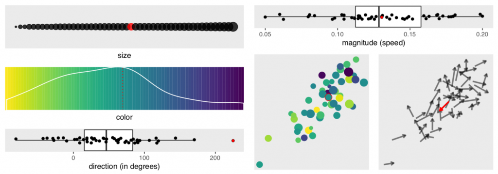
We report the results of a crowdsourced experiment that measured the accuracy of motion outlier detection in multivariate, animated scatterplots. The targets were outliers either in speed or direction of motion and were presented with varying levels of saliency in dimensions that are irrelevant to the task of motion outlier detection (e.g., colour, size, position). We found that participants had trouble finding the outlier when it lacked irrelevant salient features and that visual channels contribute unevenly to the odds of an outlier being correctly detected. Direction of motion contributes the most to the accurate detection of speed outliers, and position contributes the most to accurate detection of direction outliers. We introduce the concept of saliency deficit in which item importance in the data space is not reflected in the visualization due to a lack of saliency. We conclude that motion outlier detection is not well supported in multivariate animated scatterplots.

This research was given an honourable mention at CHI 2019.

Materials used to conduct this research are available for download here.

Publications

    [pods name="publication" id="4212" template="Publication Template (list item)" shortcodes=1]

Acknowledgements

PhysioEx: Visual Analysis of Physiological Event Streams

In this work, we introduce a novel visualization technique, the Temporal Intensity Map, which visually integrates data values over time to reveal the frequency, duration, and timing of significant features in streaming data. We combine the Temporal Intensity Map with several coordinated visualizations of detected events in data streams to create PhysioEx, a visual dashboard for multiple heterogeneous data streams. We have applied PhysioEx in a design study in the field of neonatal medicine, to support clinical researchers exploring physiologic data streams. We evaluated our method through consultations with domain experts. Results show that our tool provides deep insight capabilities, supports hypothesis generation, and can be well integrated into the workflow of clinical researchers.

Publications

    [pods name="publication" id="4293" template="Publication Template (list item)" shortcodes=1]

Acknowledgements

Using Visual Analytics of Heart Rate Variation to Aid in Diagnostics

We present an interactive visualization tool for exploring RR interval data (the time between consecutive heartbeats) to support diagnostics. An RR interval sequence diagram allows us to reduce hours of data into a general overview as opposed to using short-term ECG strips. A simple moving average is applied to the sequence diagram to smooth out short-term variance and highlight long-term trends. The moving average is surrounded by standard deviation bands which allow us to see the fluctuations invariance. After a brief training period using these tools coupled with RR interval and RR interval difference histograms, non-expert participants (undergraduate students) were able to differentiate between normal, atrial fibrillation, and congestive heart failure.

Publications

    [pods name="publication" id="4314" template="Publication Template (list item)" shortcodes=1]

Acknowledgements

DimpVis Direct Manipulation for Visualization

In time-varying information visualizations, changes in data values over time are most often shown through animation, or through interaction with a time slider widget. We introduce a new direct manipulation technique for interacting with visual items in information visualizations to enable exploration of the time dimension. This interaction is guided by visual hint paths which indicate how a selected data item changes through the time dimension of a visualization. Using DimpVis, navigation through time is controlled by manipulating any data item along its hint path. All other items are updated to reflect the new time. We illustrate how DimpVis can be applied to time-varying scatter plots, bar charts, pie charts and heatmaps. Results from a comparative, task-oriented evaluation of DimpVis, the slider and static multiple images show that DimpVis for the scatterplot significantly outperformed multiple images, was quantitatively competitive with the slider and was subjectively preferred by participants.

Publications

    [pods name="publication" id="4362" template="Publication Template (list item)" shortcodes=1] [pods name="publication" id="4344" template="Publication Template (list item)" shortcodes=1]

Acknowledgements