Contributors:
Rishikesan Kamaleswaran, Christopher Collins, Andrew James, and Carolyn McGregor
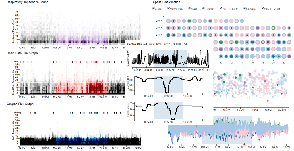
In this work, we introduce a novel visualization technique, the Temporal Intensity Map, which visually integrates data values over time to reveal the frequency, duration, and timing of significant features in streaming data. We combine the Temporal Intensity Map with several coordinated visualizations of detected events in data streams to create PhysioEx, a visual dashboard for multiple heterogeneous data streams. We have applied PhysioEx in a design study in the field of neonatal medicine, to support clinical researchers exploring physiologic data streams. We evaluated our method through consultations with domain experts. Results show that our tool provides deep insight capabilities, supports hypothesis generation, and can be well integrated into the workflow of clinical researchers.
Publications
-
[pods name="publication" id="4293" template="Publication Template (list item)" shortcodes=1]
Acknowledgements