Menu Close

Parallel Tag Clouds

Contributors:

Christopher Collins, Fernanda B. Viégas, and Martin Wattenberg

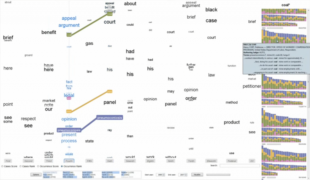
Do court cases differ from place to place? What kind of picture do we get by looking at a country’s collection of law cases? We introduce Parallel Tag Clouds: a new way to visualize differences amongst facets of very large metadata-rich text corpora. We have pointed Parallel Tag Clouds at a collection of over 600,000 US Circuit Court decisions spanning a period of 50 years and have discovered regional as well as linguistic differences between courts. The visualization technique combines graphical elements from parallel coordinates and traditional tag clouds to provide rich overviews of a document collection while acting as an entry point for the exploration of individual texts. We augment basic parallel tag clouds with a details-in-context display and an option to visualize changes over a second facet of the data, such as time. We also address text mining challenges such as selecting the best words to visualize, and how to do so in reasonable time periods to maintain interactivity.

This research was given the VAST Test of Time Award at the IEEE Conference in 2019.

Publications

    [pods name="publication" id="4449" template="Publication Template (list item)" shortcodes=1]

DAViewer: Facilitating Discourse Analysis with Interactive Visualization

Contributors:

Jian Zhao, Fanny Chevalier, Christopher Collins, and Ravin Balakrishnan

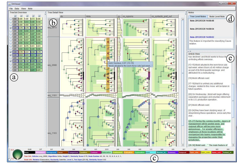
A discourse parser is a natural language processing system that can represent the organization of a document based on a rhetorical structure tree—one of the key data structures enabling applications such as text summarization, question answering and dialogue generation. Computational linguistics researchers currently rely on manually exploring and comparing the discourse structures to get intuitions for improving parsing algorithms. In this paper, we present DAViewer, an interactive visualization system for assisting computational linguistics researchers to explore, compare, evaluate and annotate the results of discourse parsers. An iterative user-centred design process with domain experts was conducted in the development of DAViewer. We report the results of an informal formative study of the system to better understand how the proposed visualization and interaction techniques are used in the real research environment.

Resources

Publications

    [pods name="publication" id="4401" template="Publication Template (list item)" shortcodes=1]

Acknowledgements

Abbreviating Text Labels on Demand

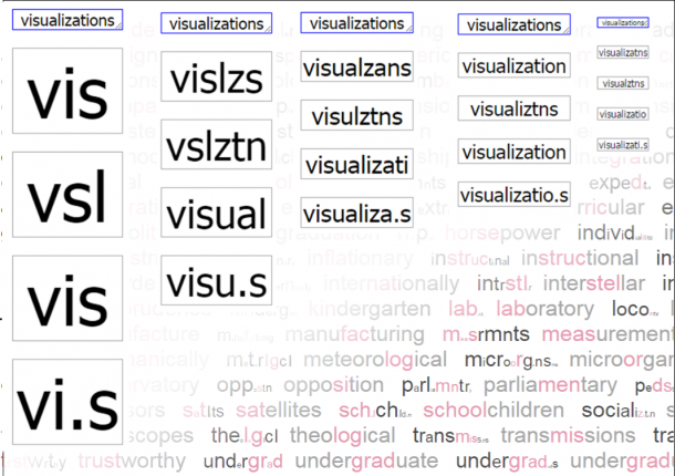
A known problem in information visualization labelling is when the text is too long to fit in the label space. There are some commonly known techniques used in order to solve this problem like setting a very small font size. On the other hand, sometimes the font size is so small that the text can be difficult to read. Wrapping sentences, dropping letters and text truncation can also be used. However, there is no research on how these techniques affect the legibility and readability of the visualization. In other words, we don’t know whether or not applying these techniques is the best way to tackle this issue. This thesis describes the design and implementation of a crowdsourced study that uses a recommendation system to narrow down abbreviations created by participants allowing us to efficiently collect and test the data in the same session. The study design also aims to investigate the effect of semantic context on the abbreviation that the participants create and the ability to decode them. Finally, based on the study data analysis we present a new technique to automatically make words as short as they need to be to maintain text legibility and readability.

Based on this project we implemented and made available online an API that allows other programmers to use our abbreviation algorithm in their web applications.

Check out our GitHub Repository for source code related to this project.

Download the crowd-sourced dataset.

For some demos applying our “Abbreviation on Demand” algorithm, and some visualizations of our study data access: http://vialab.science.uoit.ca/abbrVisualization/

Publications

    [pods name="publication" id="4248" template="Publication Template (list item)" shortcodes=1] [pods name="publication" id="4251" template="Publication Template (list item)" shortcodes=1] [pods name="publication" id="4254" template="Publication Template (list item)" shortcodes=1]

Saliency Deficit and Motion Outlier Detection in Animated Scatterplots

Contributors:

Rafael Veras and Christopher Collins

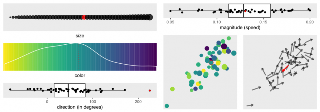
We report the results of a crowdsourced experiment that measured the accuracy of motion outlier detection in multivariate, animated scatterplots. The targets were outliers either in speed or direction of motion and were presented with varying levels of saliency in dimensions that are irrelevant to the task of motion outlier detection (e.g., colour, size, position). We found that participants had trouble finding the outlier when it lacked irrelevant salient features and that visual channels contribute unevenly to the odds of an outlier being correctly detected. Direction of motion contributes the most to the accurate detection of speed outliers, and position contributes the most to accurate detection of direction outliers. We introduce the concept of saliency deficit in which item importance in the data space is not reflected in the visualization due to a lack of saliency. We conclude that motion outlier detection is not well supported in multivariate animated scatterplots.

This research was given an honourable mention at CHI 2019.

Materials used to conduct this research are available for download here.

Publications

    [pods name="publication" id="4212" template="Publication Template (list item)" shortcodes=1]

Acknowledgements

Discriminability Tests for Visualization Effectiveness and Scalability

Contributors:

Rafael Veras and Christopher Collins

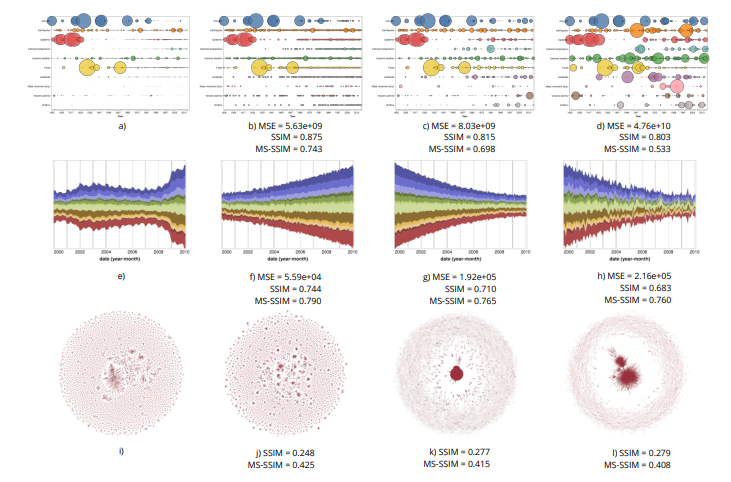
The scalability of a particular visualization approach is limited by the ability of people to discern differences between plots made with different datasets. Ideally, when the data changes, the visualization changes in perceptible ways. This relation breaks down when there is a mismatch between the encoding and the character of the dataset being viewed. Unfortunately, visualizations are often designed and evaluated without fully exploring how they will respond to a wide variety of datasets. We explore the use of an image similarity measure, the Multi-Scale Structural Similarity Index (MS-SSIM), for testing the discriminability of a data visualization across a variety of datasets. MS-SSIM is able to capture the similarity of two visualizations across multiple scales, including low-level granular changes and high-level patterns. Significant data changes that are not captured by the MS-SSIM indicate visualizations of low discriminability and effectiveness. The measure’s utility is demonstrated with two empirical studies. In the first, we compare human similarity judgments and MS-SSIM scores for a collection of scatterplots. In the second, we compute the discriminability values for a set of basic visualizations and compare them with empirical measurements of effectiveness. In both cases, the analyses show that the computational measure is able to approximate empirical results. Our approach can be used to rank competing encodings on their discriminability and to aid in selecting visualizations for a particular type of data distribution.

Materials related to this research are available for download here.

Publications

    [pods name="publication" id="4161" template="Publication Template (list item)" shortcodes=1]

Acknowledgements

We acknowledge the support of the Natural Sciences and Engineering Research Council of Canada (NSERC) and Fundac¸ao CAPES (9078- ˜ 13-4/Ciencia sem Fronteiras).

Investigating the Semantic Patterns of Passwords

Summary

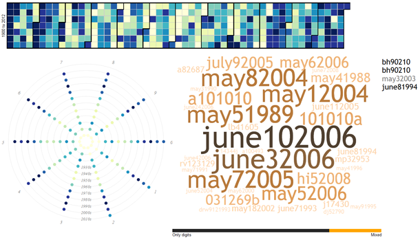
What is the meaning within a password?  And, how does the meaning in your password relate to security risks?  In our research into the ‘secret language of passwords,’ we have investigated the numerical and textual patterns from a semantic (meaning) point of view.  Where prior research investigated letter and number sequences to expose vulnerable passwords, such as “password123,” our research has delved into the composition of seemingly complex passwords such as “ilovedan1201” or “may101982” and revealed common patterns.  In these cases, the patterns of <I><love><male-name><number> and <month in letters><day in numbers><year after 1980 in numbers> are common patterns which, once learned, can be used to generate password guesses, such as “IloveMike203” and “July022001”.

Using linguistic analysis and interactive visualization techniques, we have investigated the patterns of date-like numbers in passwords, and the meaning and relationships between types of words in passwords.  The resulting analysis guided our creation of a password guessing system (not available to the public!) which on several measures is better than any prior published result.  The exposed vulnerabilities are motivating our ongoing work into new ways to help people create semantically secure passwords. This research contributed to a major story in the New York Times Magazine on the Secret Life of Passwords.

Our research started with the many large password leaks that were made publicly available on the Internet.  In particular, the 32 million passwords from the RockYou website, exposed in 2009.

Our published research was conducted in two phases:

Date and Numbers

We started exploring date patterns, as 24% of the RockYou passwords contain a numeric sequence of at least 4 digits. So we wondered whether or not these sequences are dates, and if so, are there any temporal patterns? Our analyses found that 6% of these passwords (almost 2 million accounts!) contain numbers that match a date. To facilitate exploration of the patterns in the choice of dates, we created an interface that allows one to find the frequency that each day, month, year or decade (back to the year 1900) is referred to, as well as the corresponding passwords. We did not count passwords with numbers that are more likely to be keyboard patterns than dates, such as “111111”. Exploring the data through this interface, we confirmed some predictable patterns, such as the preference for dates that have repeated days and months (e.g., 08/08/1989), but also uncovered hidden ones, such as a consistent preference for the first two days of months, holidays, and a few notorious dates (e.g., Titanic accident) . For a detailed report on this work please read our paper or try our exploratory interface.

Words and Building a Password Grammar

In the second part of this research, we turned our attention to semantic patterns in the choice of words. Employing natural language processing techniques, we broke each password into words and classified the words according to their syntactic (grammar) function and semantic (meaning) content. The result is a rich model representing the syntactic and semantic patterns of a collection of passwords. With this model, we can rank the semantic categories to find that “love” is the most prevalent verb in passwords, “honey” is the most used food-related word, and “monkey” is the most popular animal, for example. Contrary to reported psychology research, we found that many categories related to sexuality and profanity are among the top 100. Our work also brought insight into the relations between concepts; for example, our model shows that a male name is four times more likely to follow the string “ilove” than a female name. Our paper, published in the NDSS Symposium 2014, discusses the security implications of our work. In summary, we show that the security provided by passwords is overestimated by methods that do not account for semantic patterns.

Online Demos

Try the dates visualization yourself!

Try the words visualization yourself! 

Software

Semantic-Guesser

Media Coverage

Our research has also been featured in additional media, including:

We have also been featured on UOIT Homepage, including an article entitled “Heartbleed update: UOIT researchers analyze why consumers use weak passwords“.

Publications

    [pods name="publication" id="4365" template="Publication Template (list item)" shortcodes=1] [pods name="publication" id="4398" template="Publication Template (list item)" shortcodes=1] [pods name="publication" id="4347" template="Publication Template (list item)" shortcodes=1]

Acknowledgements

Thanks to undergraduate alumni Jeffrey Hickson and Swapan Lobana who worked as research assistants on this project, and to the funding agencies who supported this work.

Balancing Clutter and Information in Large Hierarchical Visualizations

Contributors:

Rafael Veras and Christopher Collins

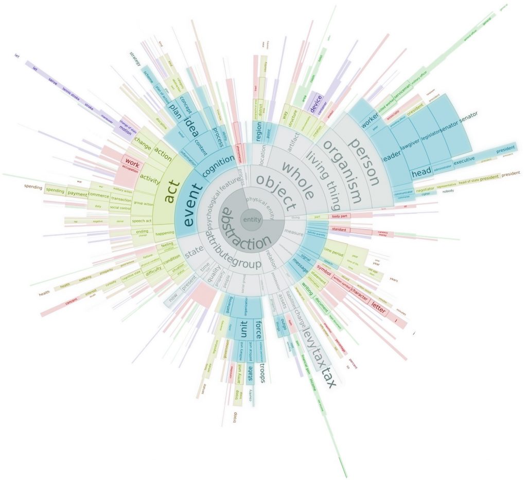
In this paper, we propose a new approach for adjusting the level of abstraction of hierarchical visualizations as a function of display size and dataset. Using the Minimum Description Length (MDL) principle, we efficiently select tree cuts that feature a good balance between clutter and information. We present MDL formulae for selecting tree cuts tailored to treemap and sunburst diagrams and discuss how the approach can be extended to other types of multilevel visualizations. In addition, we demonstrate how such tree cuts can be used to enhance drill-down interaction in hierarchical visualizations by enabling quick exposure of important outliers. The paper features applications of the proposed technique on treemaps of the Directory Mozilla (DMOZ) dataset (over 500,000 nodes), and on the Docuburst text visualization tool (over 100,000 nodes).

Validation is done with the feature congestion measure of clutter in views of a subset of the current DMOZ web directory. The results show that MDL views achieve near-constant clutter levels across display resolutions. We also present the results of a crowdsourced user study where participants were asked to find targets in views of DMOZ generated by our approach and a set of baseline aggregation methods. The results suggest that, in some conditions, participants are able to locate targets (in particular, outliers) faster using the proposed approach.

Check out our GitHub Repository for source code related to this project.

The slides from our VIS 16 presentation are available here.

Publications

    [pods name="publication" id="4278" template="Publication Template (list item)" shortcodes=1] [pods name="publication" id="4350" template="Publication Template (list item)" shortcodes=1]

Acknowledgements

Interaction-Driven Metrics and Bias-Mitigating Suggestions

Contributors:

Mahmood Jasim, Ali Sarvghad, Christopher Collins, Narges Mahyar

Abstract

In this study, we investigate how supporting serendipitous discovery and analysis of online product reviews can encourage readers to explore reviews more comprehensively prior to making purchase decisions. We propose two interventions — Exploration Metrics that can help readers understand and track their exploration patterns through visual indicators and a Bias Mitigation Model that intends to maximize knowledge discovery by suggesting sentiment and semantically diverse reviews. We designed, developed, and evaluated a text analytics system called Serendyze, where we integrated these interventions. We asked 100 crowd workers to use Serendyze to make purchase decisions based on product reviews. Our evaluation suggests that exploration metrics enabled readers to efficiently cover more reviews in a balanced way, and suggestions from the bias mitigation model influenced readers to make confident data-driven decisions. We discuss the role of user agency and trust in text-level analysis systems and their applicability in domains beyond review exploration

Website

serendyze.cs.umass.edu


Video

Publications

    [pods name="publication" id="9141" template="Publication Template (list item)" shortcodes=1]